My team developed a range of communication tools to support The New York Times’ extension of their brand into new markets, a key part of the successful digital transformation of its business.
A toolkit to reinforce journalism’s most prestigious brand and align new services
Both inside and outside the newsroom, there is a notion of what makes something ‘Timesian’—their brand essence. Staff who are familiar with the organization come to have an innate understanding of these concepts, but collaborators and external partners often struggle to create work that aligns to it.
My team played a key role in a multi-year effort with the Times’ design team to codify its design tools into a cogent set of principles and rules to help make every communication reflect this essence.
The resulting ‘brand book’ is used to this day by those inside the organization, as well marketers, designers and advertisers that partner with The New York Times.


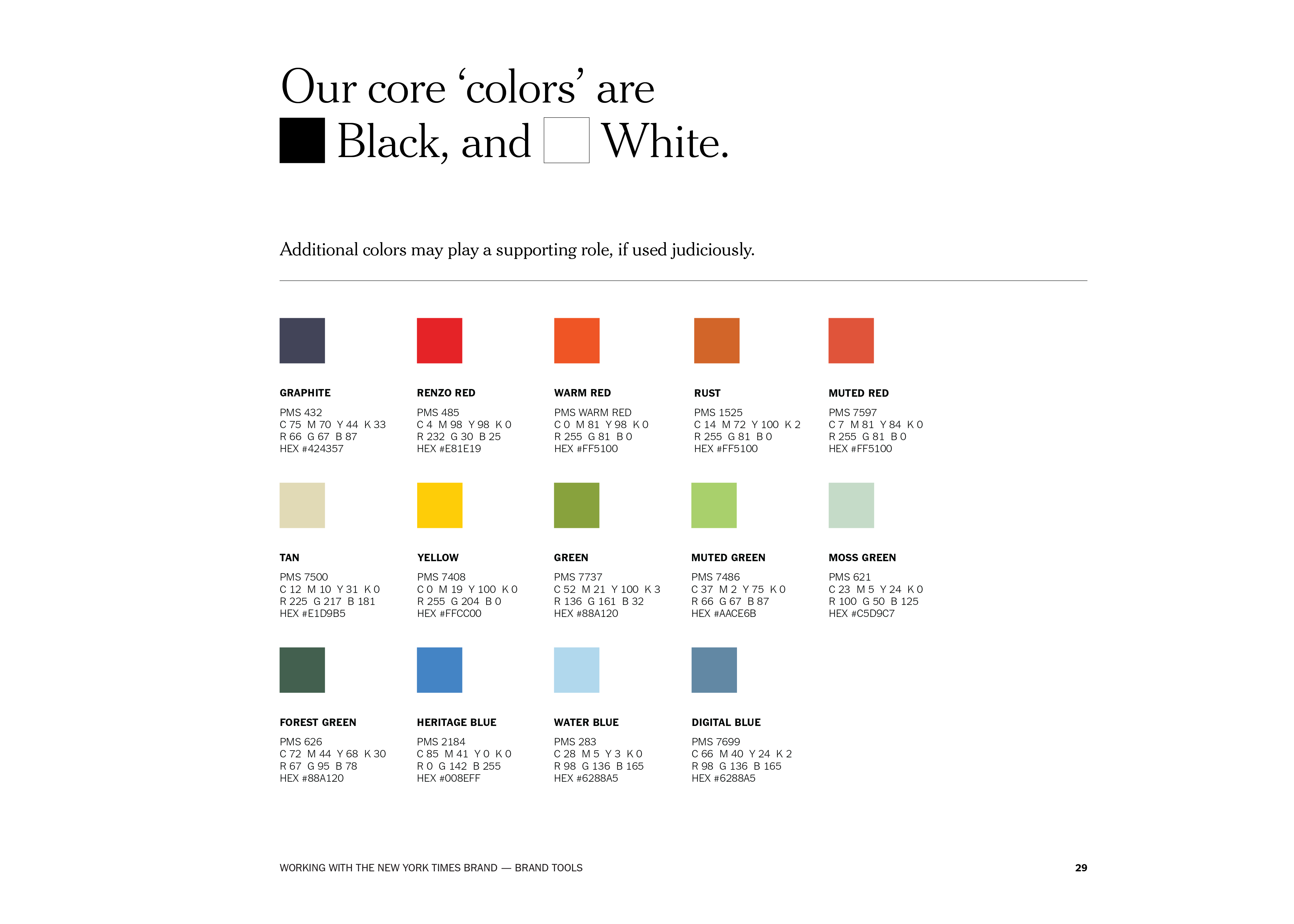
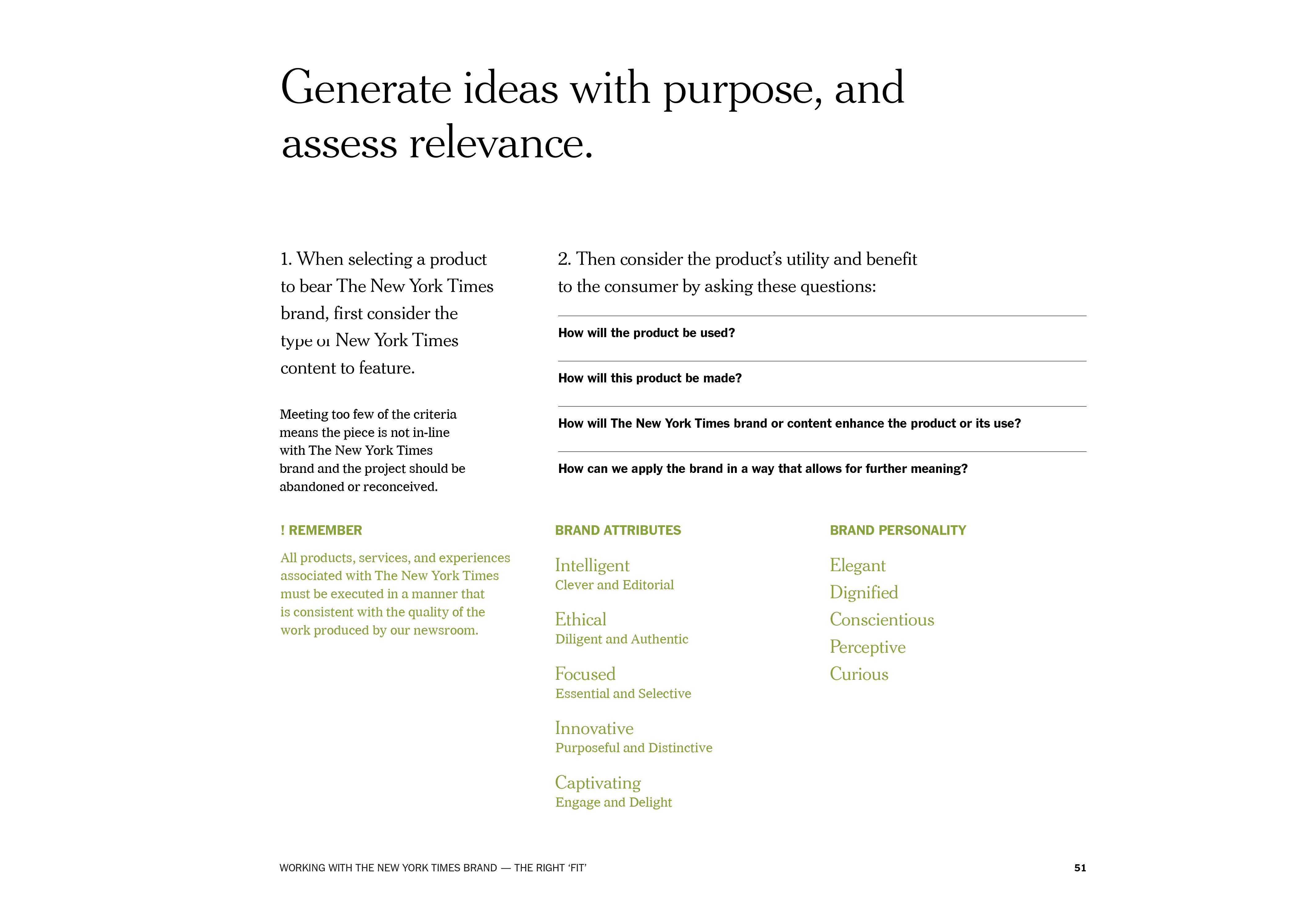
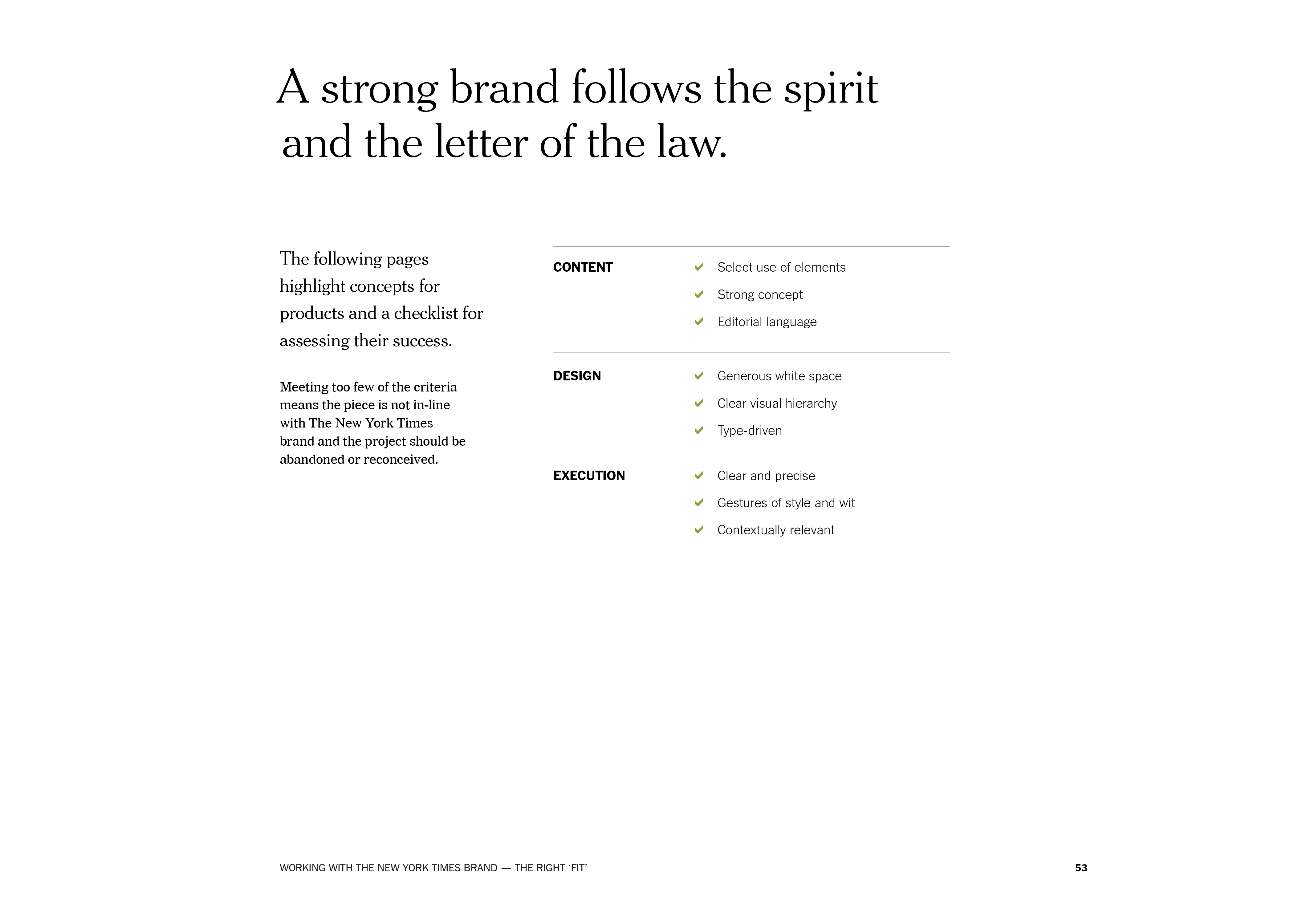
We developed a set of principles upon which all communication should be built, allowing them to become a touchstone for judging quality of execution
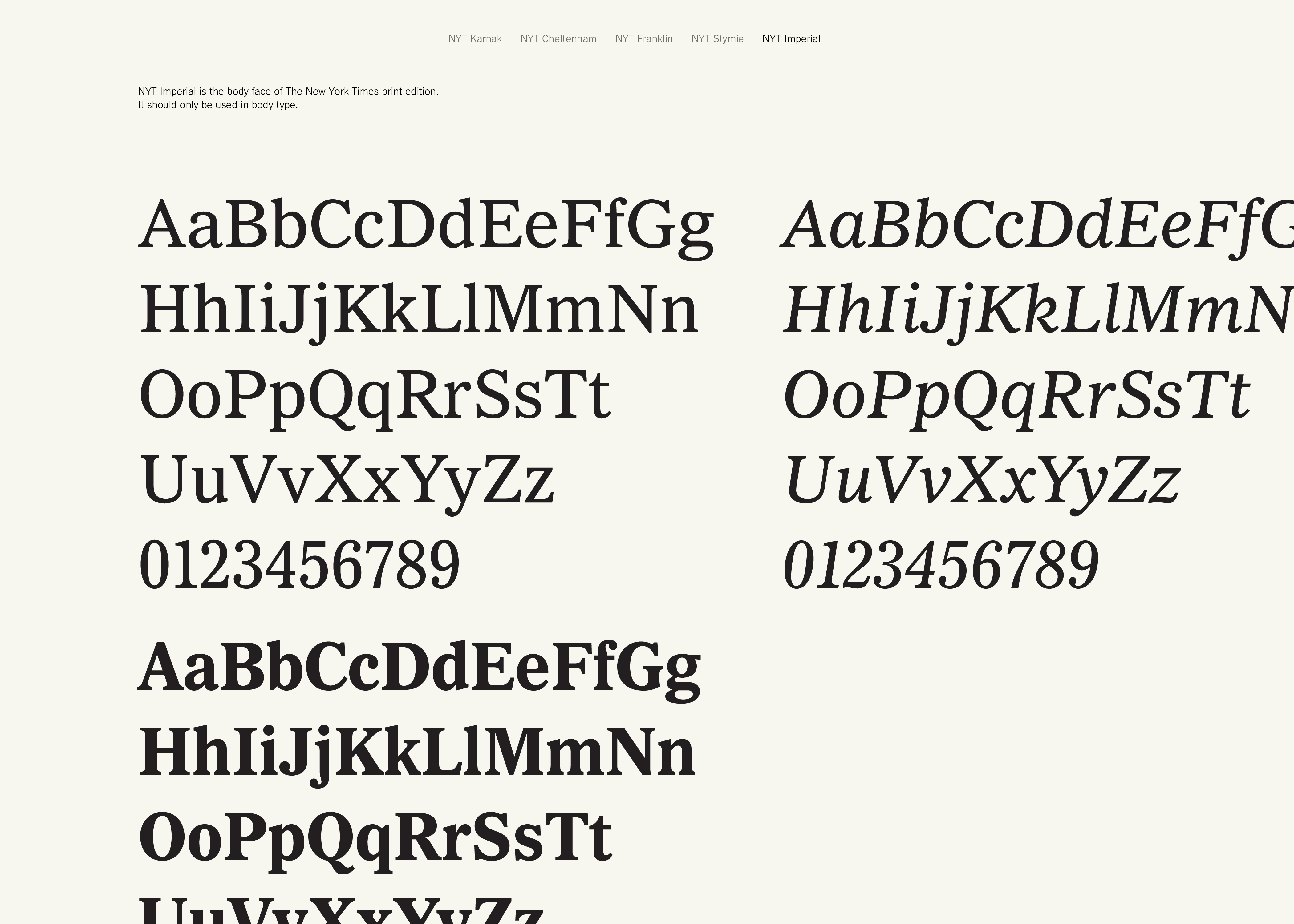
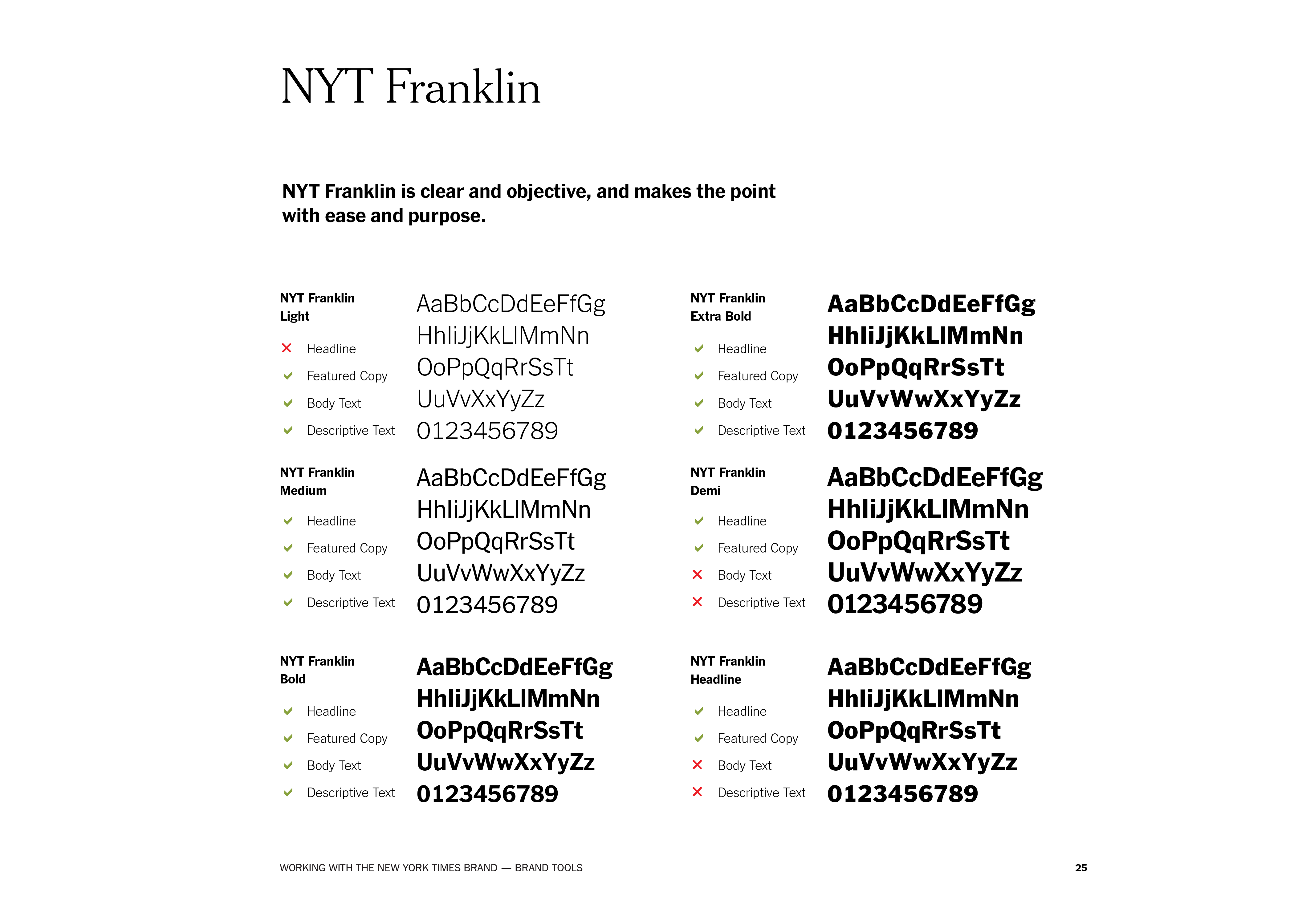
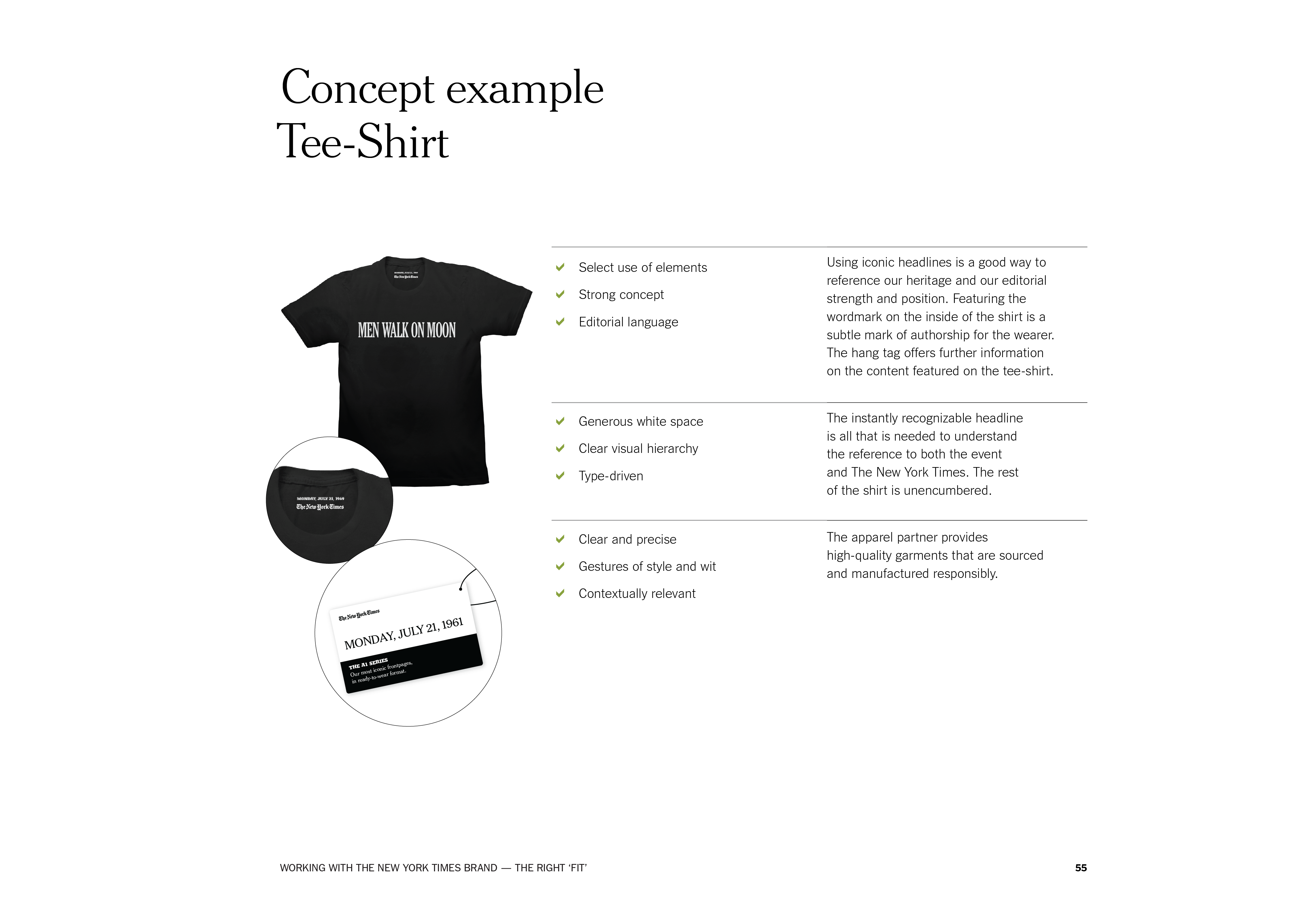
Being a brand steeped in journalism, typography is critical to how the brand expresses itself. We organized the broad existing typographic palette into personalities, helping the design teams pick the right tone for each communication

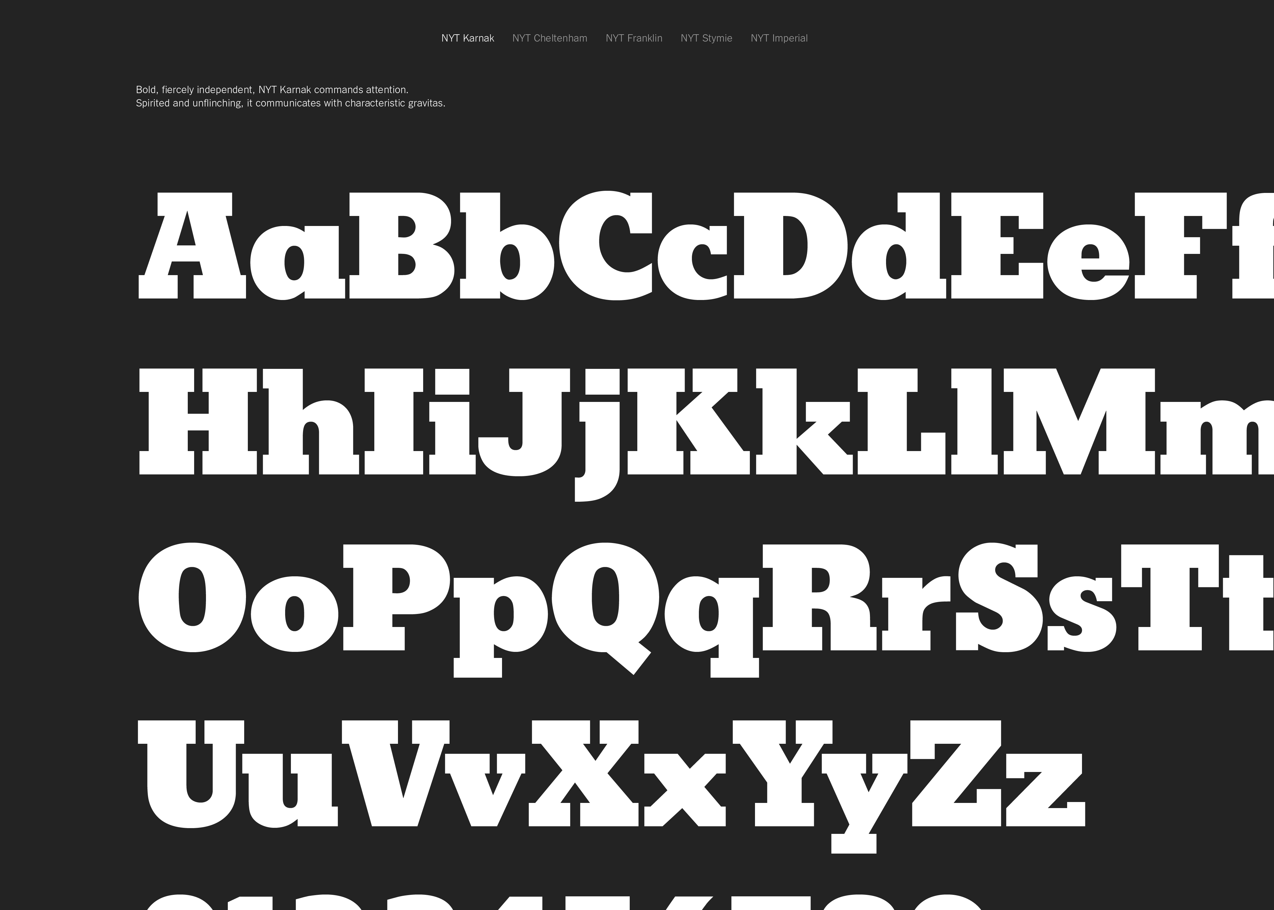
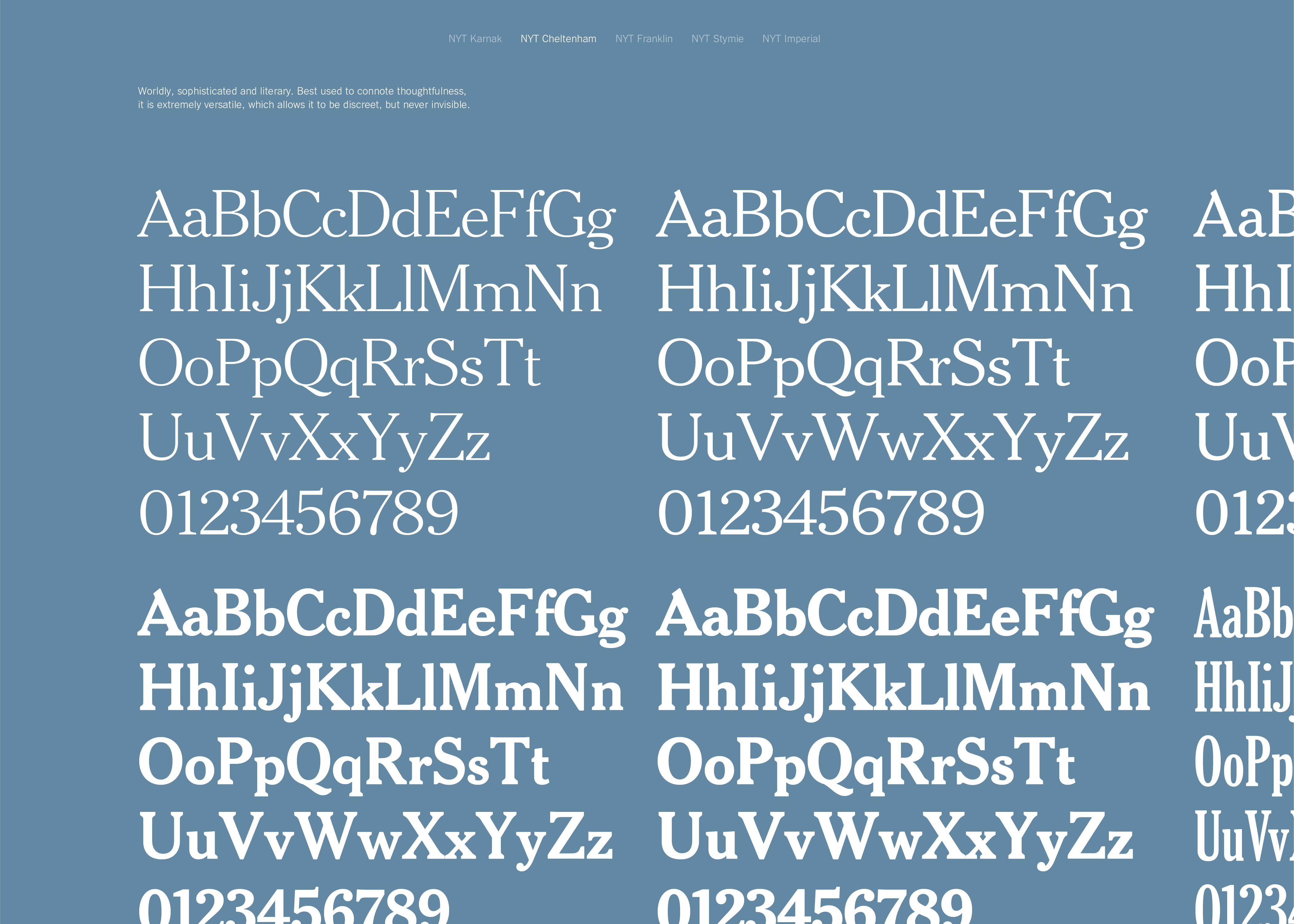
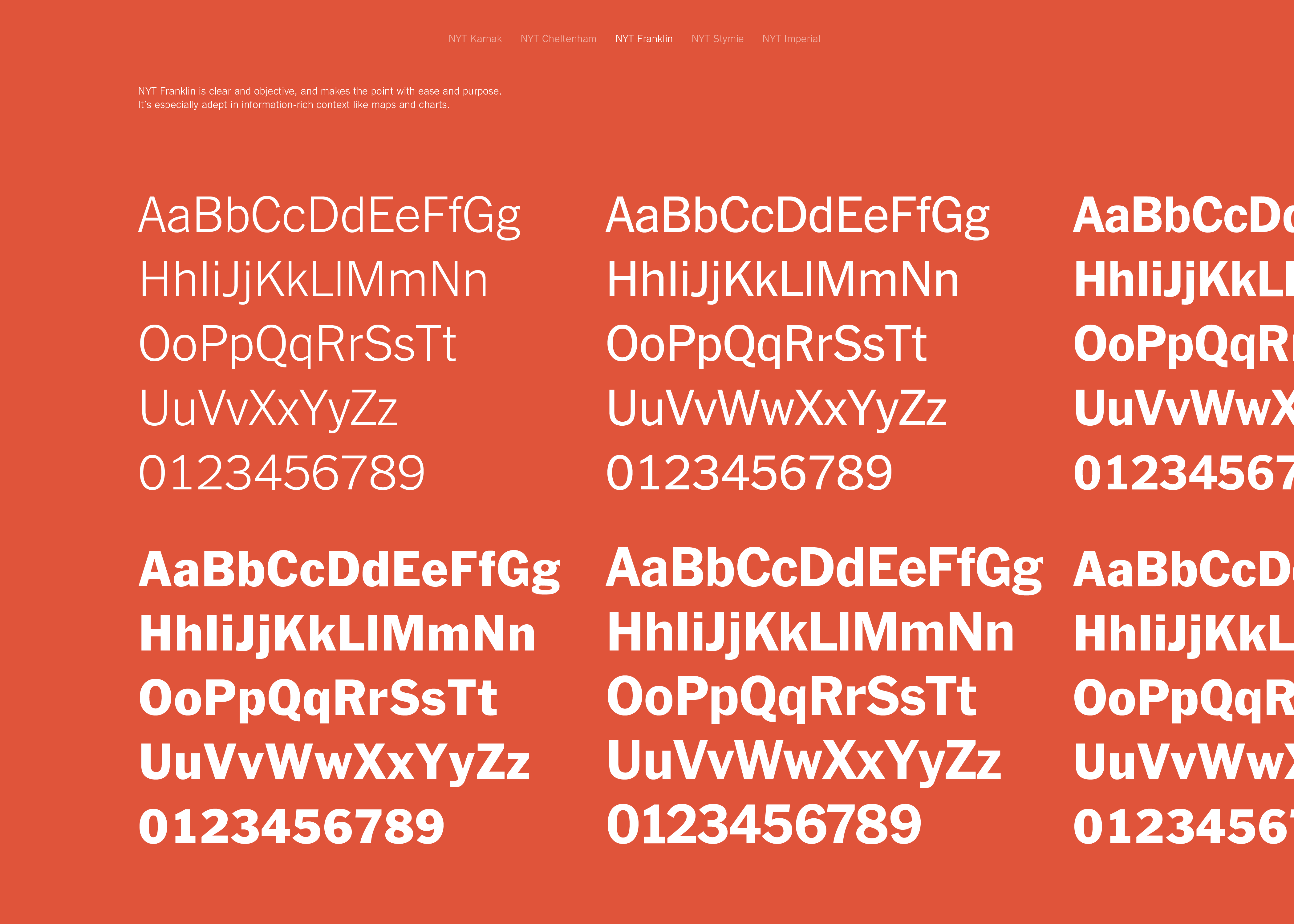
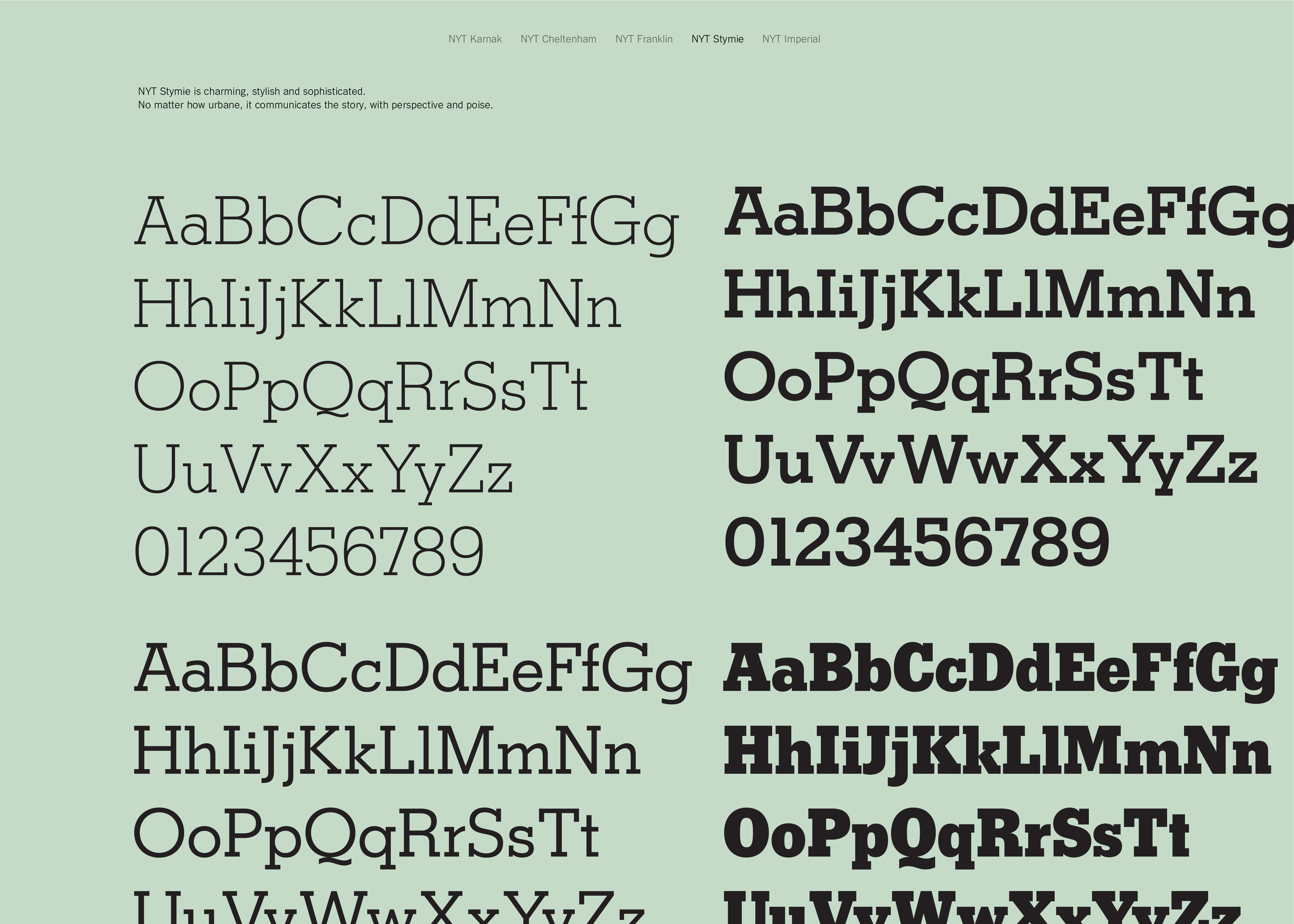
All of this was codified into a brand book that not only provides the typical specifications and details, but also offers worksheets for determining adherence to ‘Timesian-ness’ on anything from communication to new product development.


Highlighting key differences between elements of the system helps support correct usage. The Super T has a rounder figure and bolder presence for use as a visual shortcut once the wordmark has already appeared.

A send off into the world of travel
The New York Times is celebrated the world over not just for its insightful global reporting, but also for its connoisseurship of the best hotels, restaurants, and sightseeing destinations through the paper's Travel section, famous 36 Hours column and book series, and the ever-stylish T Magazine.
My team helped the Times leverage their position in the luxury tour marketplace to reach and compel potential customers.

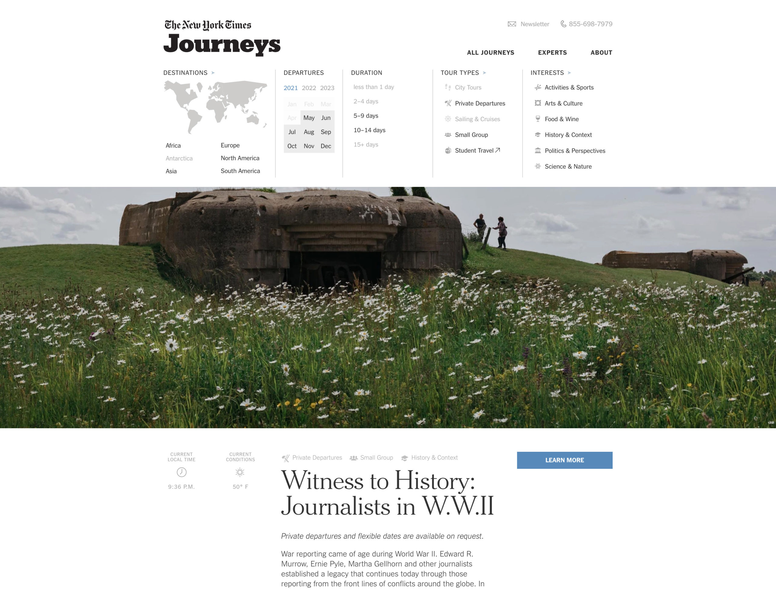
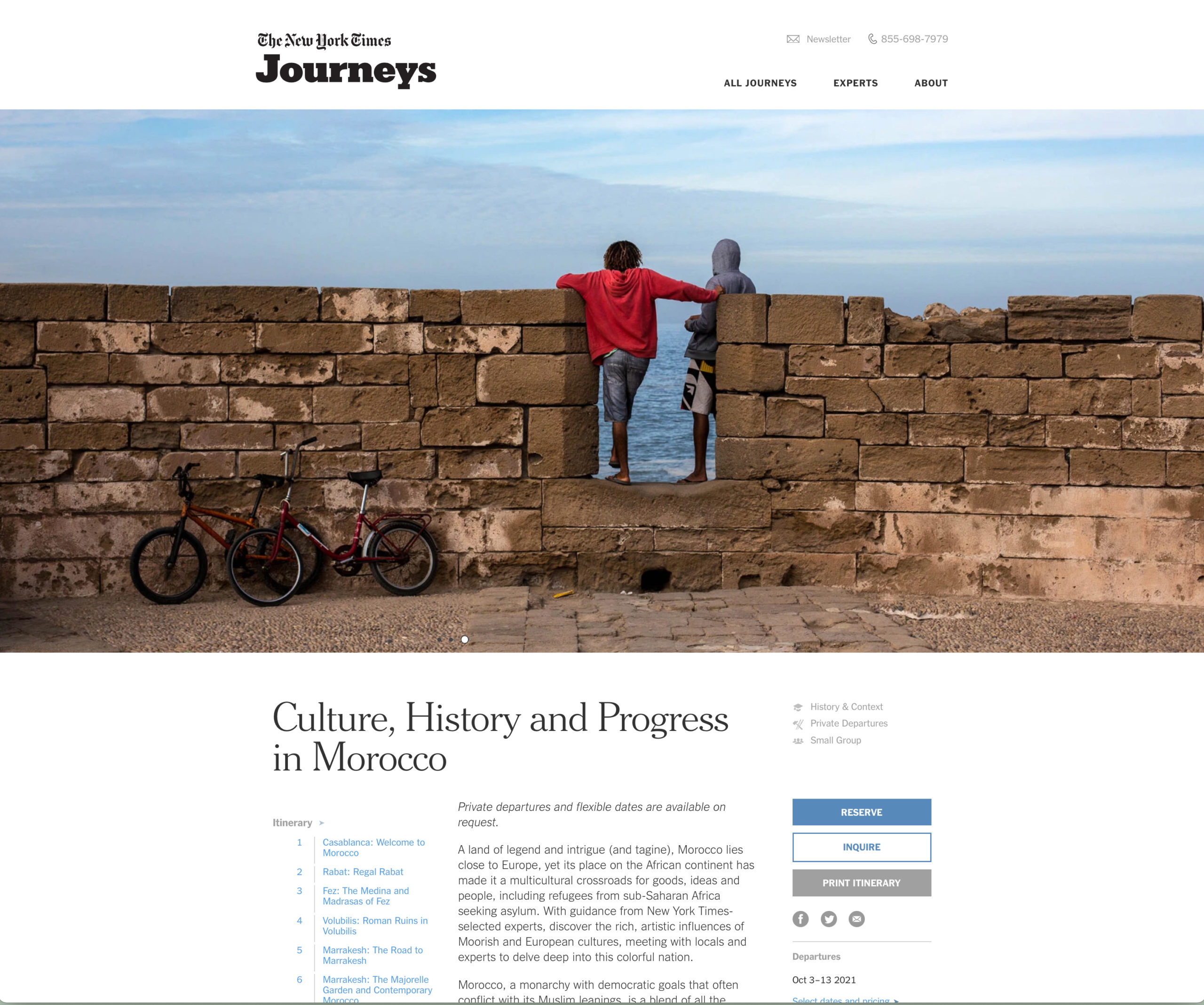
We created a Webby Award-winning website for Times Journeys where the full range of options is presented in a rich, engaging way.
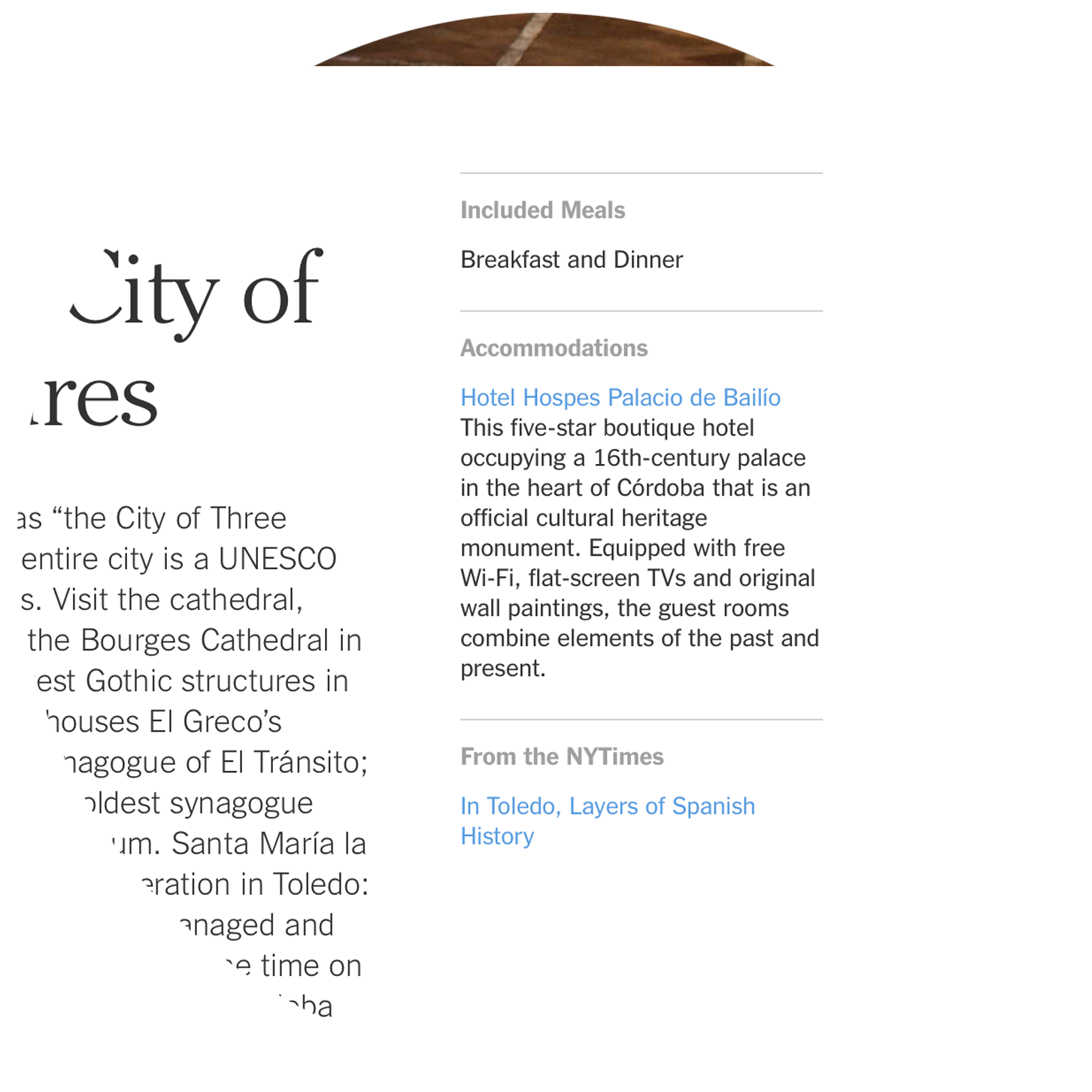
Alongside each itinerary day, a user finds relevant New York Times content which correlates the destination or journey topic. This allows the user an enriched travel planning experience.
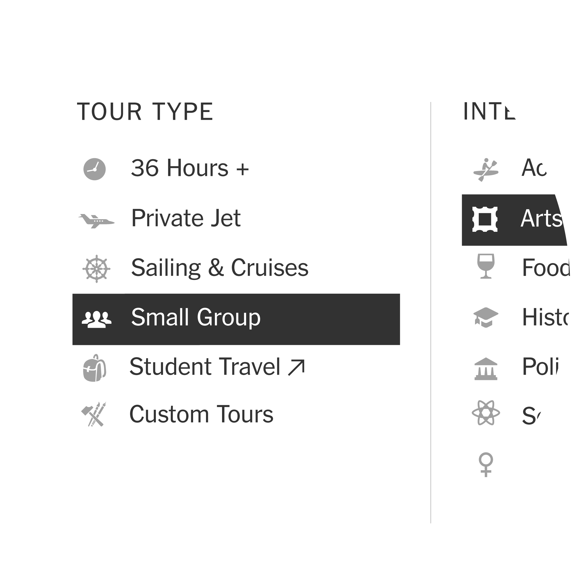
We created a set of icons that extended the NYT brand into the full range of UI elements.
Given its cultural potency, we wanted to make full use of the Times' iconic style of photography, incorporating it into the very essence of the Times Journeys brand.
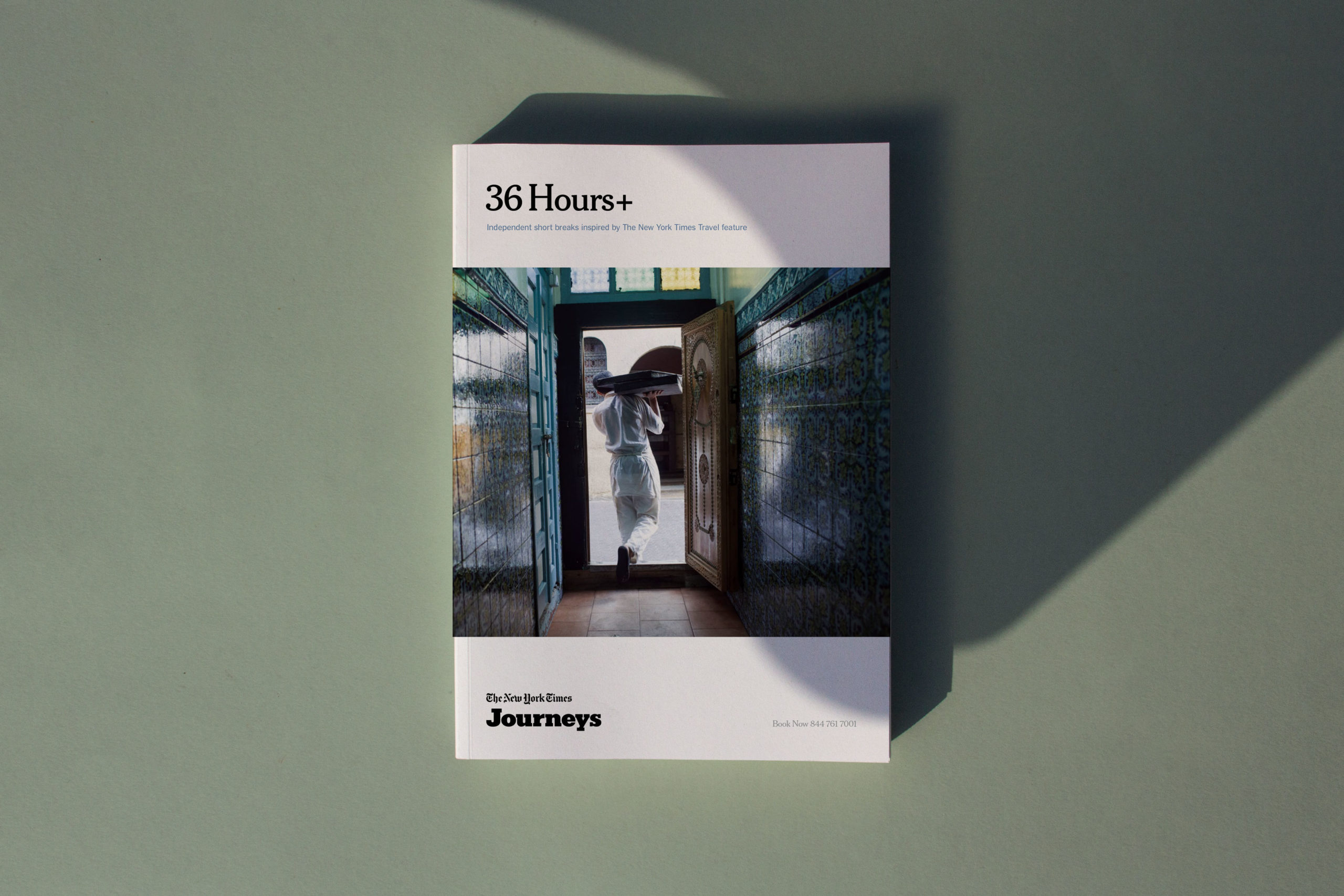
The marketing campaign we designed to launch alongside the Times Journeys website takes a similar editorial point of view, placing focus on lush photography accompanied by a slogan that sums up the experience: Travel with The New York Times.
Turning the paper of record into a school
Alongside our partners at Sotheby’s Institute of Art, we designed a digital interface for The Times’ new educational venture, The School of The New York Times. We focused on the user in both our visual design and when developing the content strategy – which included sitemaps, wireframes and program naming recommendations – ensuring users are aware of all the ways to learn with The New York Times.
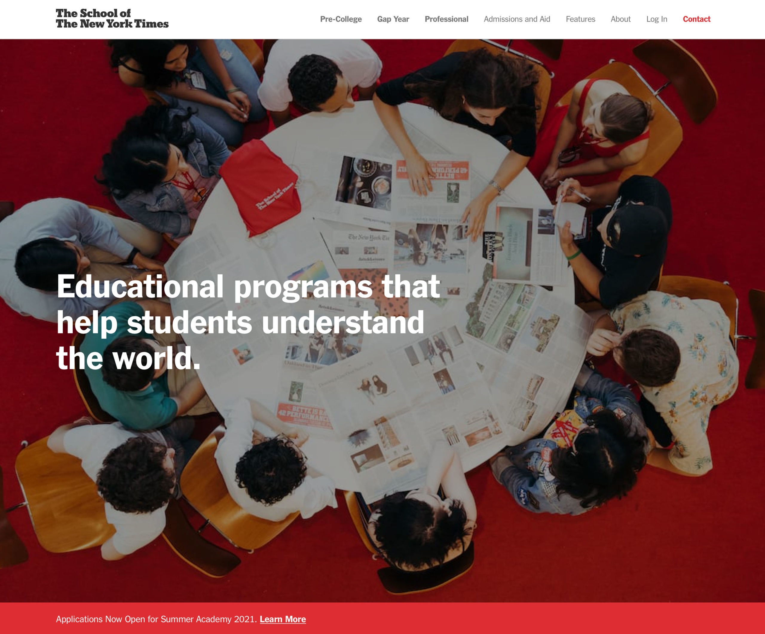
The immersive website leads to the various programs on offer and supports the brand attributes.
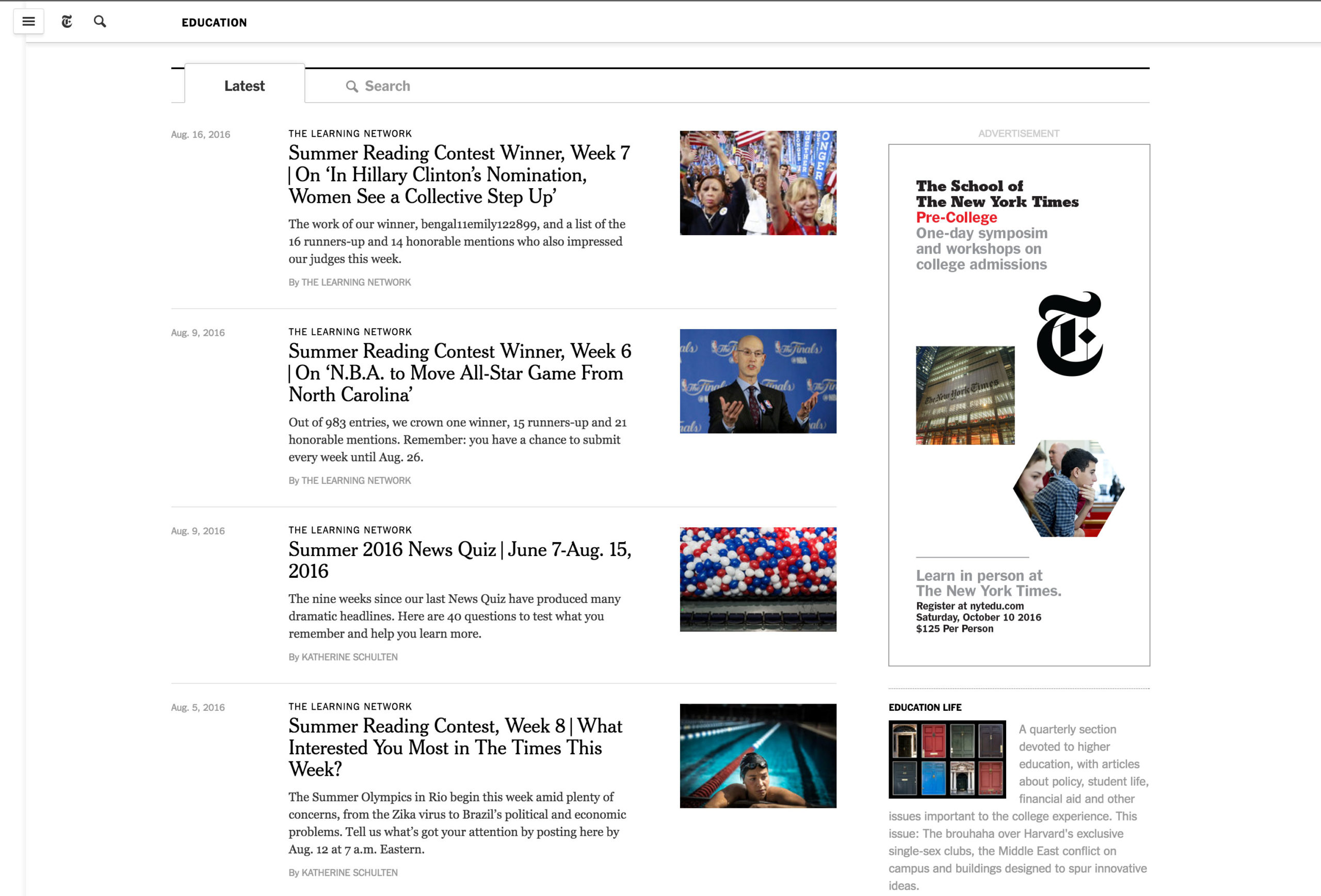
We created a campaign to promote specific programs that play off the concept of learning blocks.
Agency: Objective Subject
Strategy: Emma White, David Jalbert-Gagnier
Account: Emma White, Jessica Wilson
Creative Director: David Jalbert-Gagnier
Design: Sam Gray, Blake Olmstead, Kirk Pettinga, Elliot Arthur, Marvin Harder, John Custer
© 2026, David Jalbert-Gagnier