With core values of integrity, action and independence, the Associated Press engaged my team at Objective Subject to develop a visual identity system reflective of a dynamic news organization competing in the digital age.
As the largest news organization in the world, the AP is dedicated to reporting and delivering breaking news from the most remote corners of the globe. Recent upheaval in the media world has forced many news organizations to close their doors. A not-for-profit cooperative of American newspapers, AP saw an opportunity to revise its approach to address an evolving landscape.
Over the last decade, the organization made strides to strengthen its position as a leading provider of photo and video content. By 2009, AP was a new organization, albeit one that lacked strategic cohesion and market differentiation.
Process
We began the design process by interviewing key stakeholders to understand the critical issues with the existing system. Dominant feedback noted a lack of flexibility with the existing mark, a dated aesthetic and the impression of an overly-American feel. In our initial design assessment, the team determined that the existing letterforms hindered legibility and reproduction across mediums. Our team initially explored minimal tweaks to the logo with an aim to modernize, address legibility and improve the craft of the letterforms.
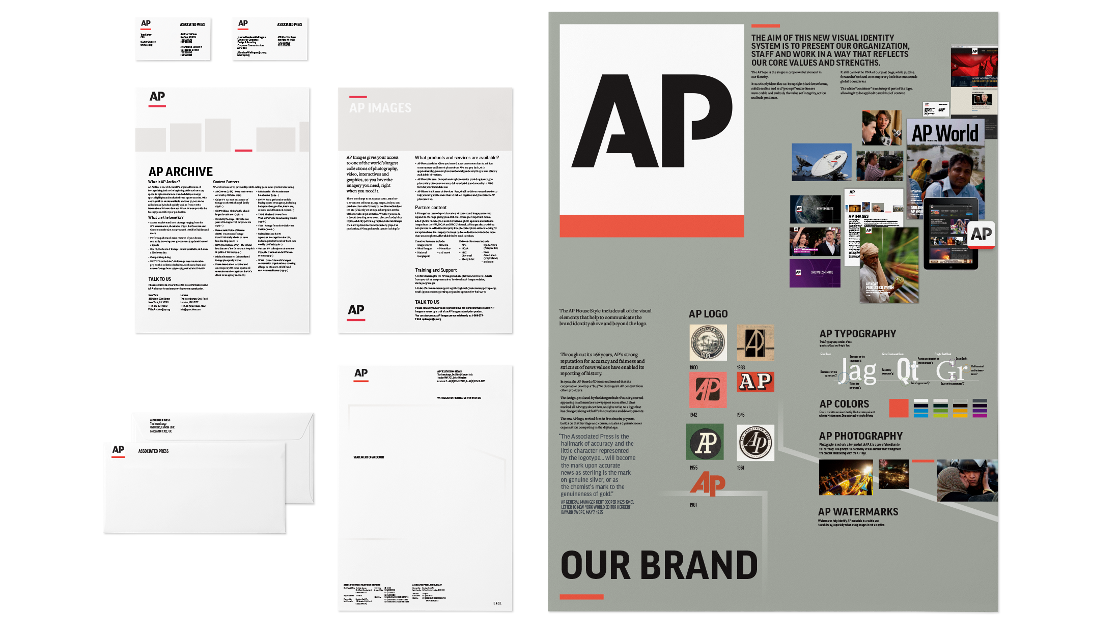
Our iterative process generated an option with a red underscore, which we dubbed ‘the prompt,’ that evokes AP’s emphasis on editorial rigor and precise and accurate approach. Setting the letterforms in black on a white backdrop proved to further highlight these values, while improving contrast and legibility. Using a consistently white backdrop further improved the strength of the mark in the variety of environments it needs to live in.
Solution
We retained the original logo’s stencil lettering, which embody the gutsy and adventurous personality of an international news organization. Redrawing the letters upright speaks to AP’s integrity, while lending a more contemporary feel to the mark.
Our team recommended a cooler, bolder, and truer red hue that both represents the dynamic nature of the news company, and allows a much-needed flexibility to reflect AP’s diverse array of products and services.
We defined a dynamic visual system to support the new mark. A range of deep colors supplement the mark’s dominant red, and selected typography offers further complement. A new visual element, called watermarks, drawn from the outline of the AP letterforms, intertwines to connote the strength of AP’s network of people, bureaus and technology.
Corporate video, developed in-house.
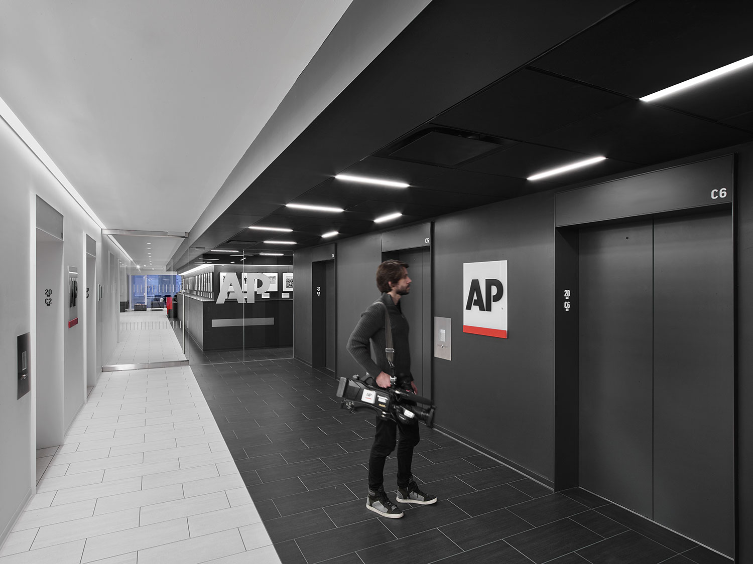
AP in the wild
Since its launch in 2012, the system has grown and come to symbolize the brand and its commitment to journalistic integrity: some candid shows of how it's come to life.
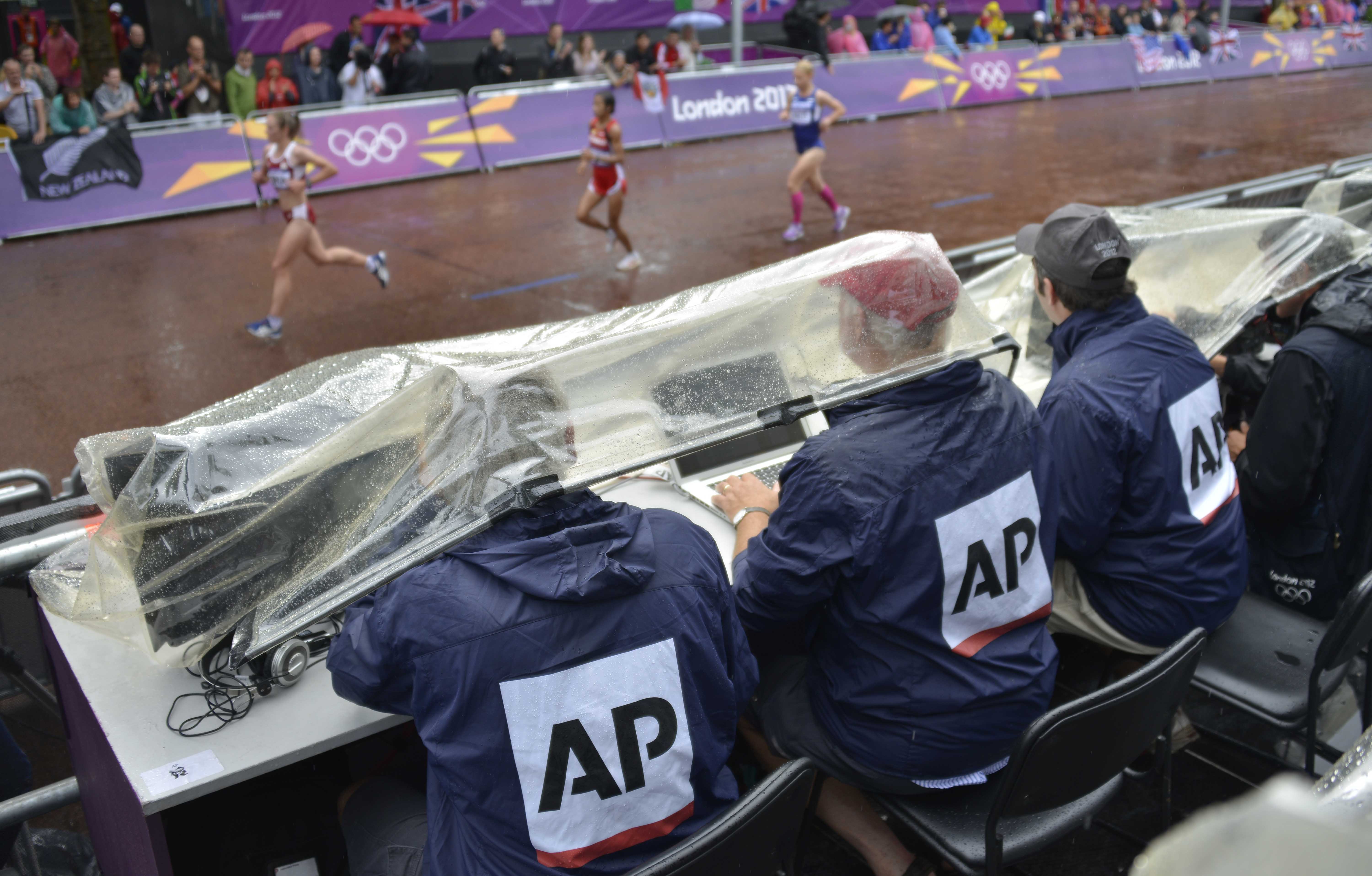
AP journalists covering the London Olympics in the rain

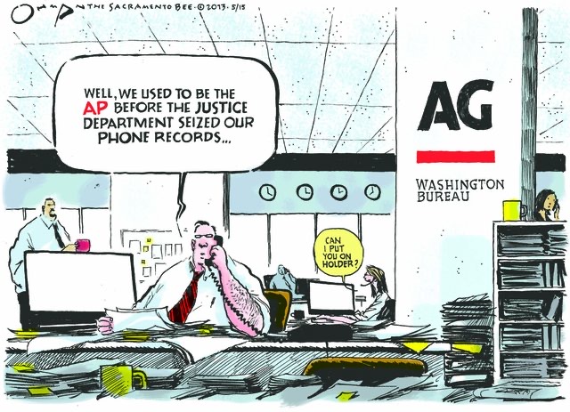
Press coverage of the 2013 bombshell on how the U.S. Justice Department had secretly obtained two months of telephone records of reporters and editors for the Associated Press in what its CEO called a “massive and unprecedented intrusion.”

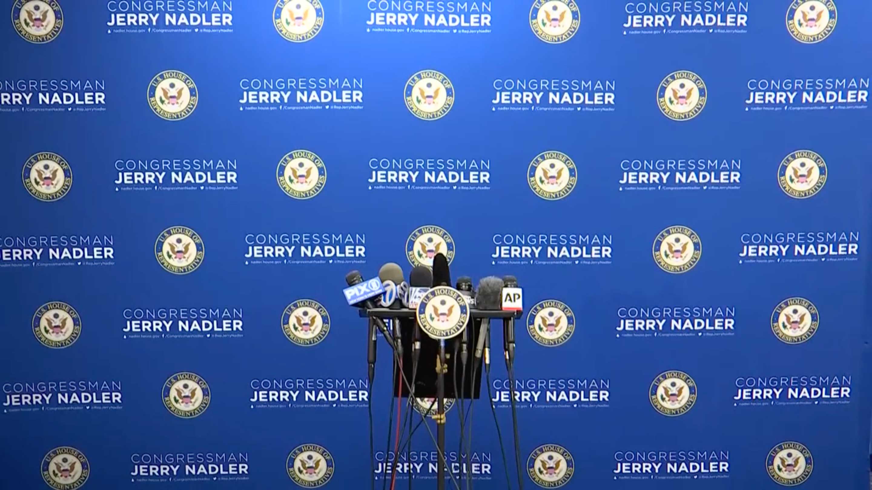

The microphone flag is a great example of the ability of the identity to cut against the visual noise of the news being covered.
They can even become memes.
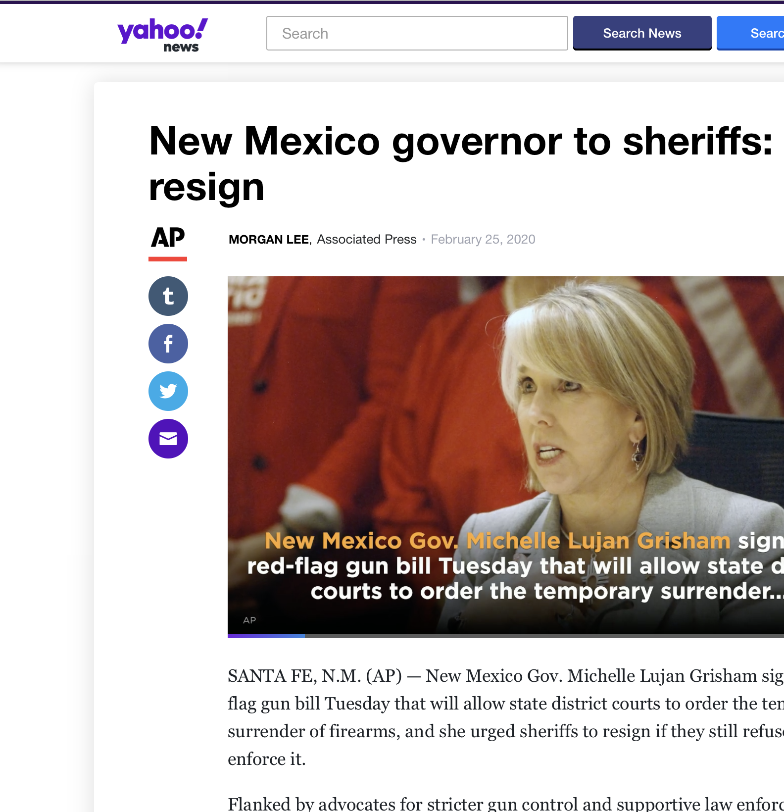
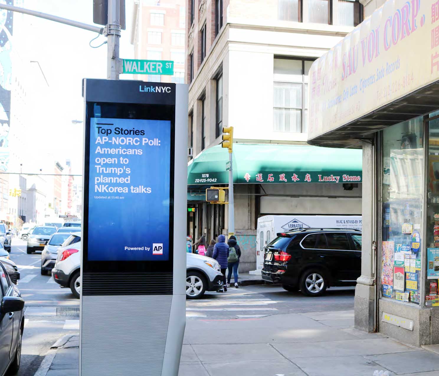
The AP mark looks at ease in myriad digital application, including those outside of the brand’s direct control
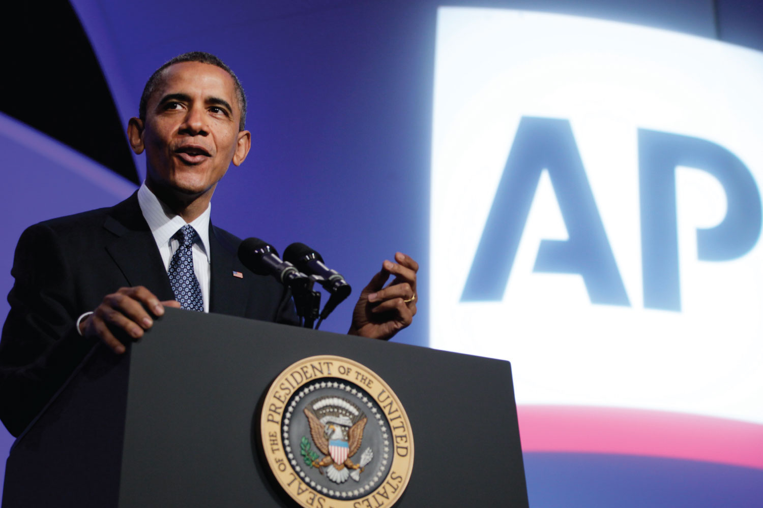

Events sponsored by AP

Video monitor at AP's HQ in London

AP equipment being ransacked at the 1/6/21 riot on the U.S. Capitol grounds, where an AP photographer was assaulted by the mob.
© 2021, David Jalbert-Gagnier